Why the Same Blue Reads Differently Across the Year
By Mariah Johnson · Updated
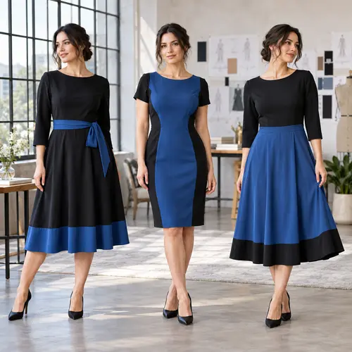
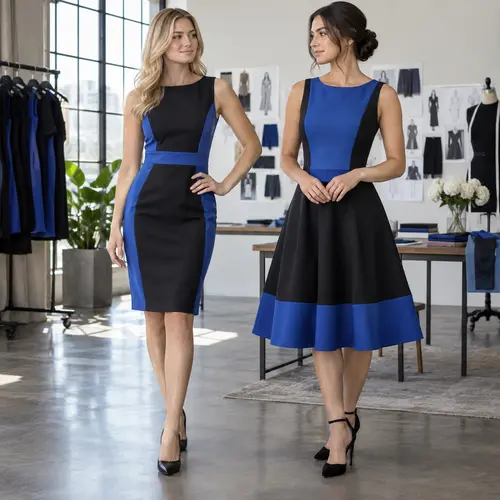
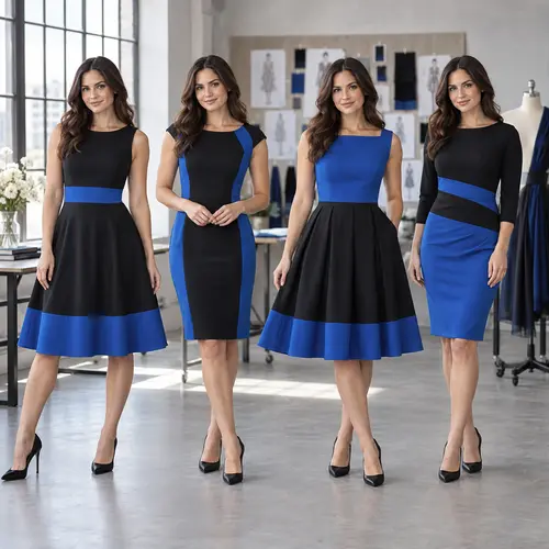
A blue and black dress doesn’t have one fixed appearance, it has four, depending on whether it’s lit by spring daylight, summer sun, autumn candlelight, or winter evening lighting. The hex code never changes. What changes is the light hitting it.
This applies to a black and blue dress and a blue and black dress equally, since the effect comes from the lighting, not from which colour is named first.
At a glance
- Spring and summer daylight is a neutral light source, shades read closest to their true hex value
- Autumn and winter indoor lighting shifts warmer and dimmer, which can mute or darken a shade
- Deep blues like navy blue are the most affected across all four conditions
- See the dedicated season pages for a full shortlist of shades chosen for each specific condition
Jump to a section
How Each Season’s Light Differs
| # | Season | Typical light source | Effect on a blue shade |
|---|---|---|---|
| 1 | Spring | Outdoor daylight, garden and daytime venues | Neutral light source. A shade's true saturation comes through undistorted, which is why pastels hold up better here than indoors. |
| 2 | Summer | Direct midday sun, outdoor and destination venues | The harshest, most direct light in this guide. Lower-saturation shades can bleach out; higher-saturation shades hold their colour. |
| 3 | Autumn | String lights, candles, tungsten fixtures | Shifts the ambient colour temperature toward orange, which can make a cool-cast blue look visually cold against the room. |
| 4 | Winter | Dim indoor evening lighting | The condition most likely to push a deep blue toward reading as black, since dim warm light compresses the visible contrast between navy blue-family shades and true black. |
Navy Blue (#000080) is the clearest example of this effect in the entire 50-shade taxonomy. It reads as a confident, clearly blue shade under spring or summer daylight, but the same dress under winter’s dim indoor evening lighting can drift close enough to true black that a photo won’t show any blue at all. See the navy blue shade profile for the specific mechanism behind why this shade in particular is so sensitive to lighting.
FAQ
Does the same dress actually look different across seasons, or is this just marketing?
It's a real optical effect, not marketing. Colour perception depends on the light source's colour temperature as much as the fabric's actual pigment, and the four lighting conditions in the table above genuinely differ enough to change how saturated or how dark a shade appears. This is the same underlying mechanism covered in the flagship shade guide's flash notes, applied across a full year rather than a single camera flash.
Should I buy a different blue for each season?
Not necessarily, but it's worth checking a shade's behaviour under the specific lighting your event will actually use before assuming a dress that photographed well at one event will photograph the same way at another. A versatile mid-saturation shade like sapphire blue or classic blue tends to hold up more consistently across all four seasons than a shade at either extreme, very pale pastels or very deep near-black blues.
Which season is hardest to shop for?
Winter, by a clear margin. Dim indoor evening lighting is the condition most likely to push a deep blue toward reading as black, which is why the winter season guide specifically recommends sapphire blue over the more common navy blue default. See that guide for the full reasoning.
Why does navy blue specifically get mentioned so often across these guides?
Because it sits closest to true black in luminance of any commonly worn shade, which makes it the most lighting-sensitive colour in this entire guide. It's used as the reference example throughout because if a lighting condition is going to cause a problem, navy blue shows that problem first and most clearly.
Related guides
Mariah Johnson
Editor, Blue and Black Dress
I maintain the shade index and the placement pattern guides on this site, verifying each hex value against real garment photography as I work through the list, and I keep the pairing tables current.
View full bioGet the shade updates
One email when a hex value gets re-verified or a new shade profile goes up. No spam, unsubscribe anytime.